
When is the best time to take pictures outside?
The question I get asked over and over by photographers starting out on their photography journey is When is the best time to take pictures outside? This will depend on several factors such as what subject you are trying to shoot, weather conditions, seasons and location but mostly photographing in soft light can give the best results especially in landscape photography.
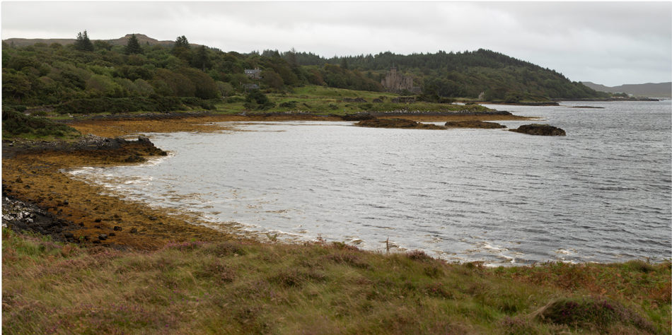
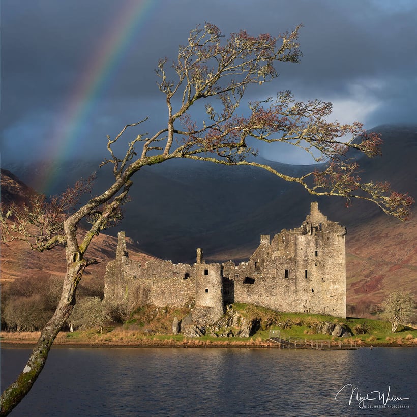
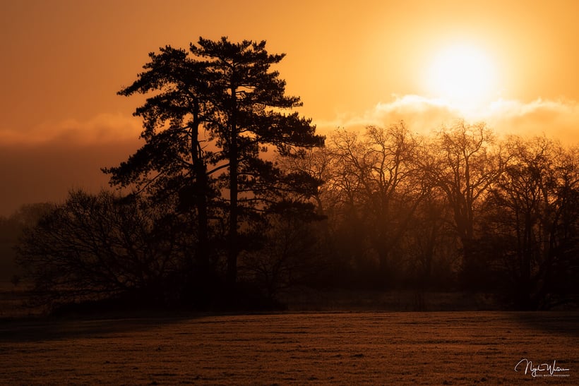
Most Landscape Photographers will often refer to roughly 30 minutes after the sun rises and before it sets as the best times of the day to take photographs during what is commonly known as “Golden Hour”. This is when the Sun is close to the horizon and daylight appears warmer and softer.
Here I explain the different times of the day in relation to the position of the sun and what affect this has on your subject so you can decide which is the best time of the day for you to take pictures outside.
The importance of light in photography
In Landscape photography or any other genre light is key to capturing beautiful photographs. The quality of light that falls upon a scene will determine a viewers emotional response to the image while influencing the photographers composition and creating a sense of depth.
This is so important when we look at two dimensional photographs taken of a three dimensional subjects and what can make or break an image.
Practicing photography within a studio allows a photographer to control the light and how the light falls on the subject and only limited by the amount of artificial lighting available or ones creativity. However once you step outside control is very limited and in landscape photography practically none existent other than the use of filters.
This why when practicing outdoor photography it important to learn and understand how natural light works, its effect on different types of scenes and how the different seasons and weather conditions effect the quality of light and how it will fall on a scene at a given time.
The key to taking successful outdoor photographs consistently is learning how to anticipate these conditions by understanding there influences on a scene and using the numerous tools and apps at your disposal.
Sunlight phases depending on the elevation of the sun
We know the importance of the Quality of Light in outdoor photography and therefore understanding how Sunlight behaves and the factors that influence it are key to capturing the images that you envisage. By knowing when each sun phase occurs and its light conditions, you will be able to assess what type of photography will be most suitable for each moment.
Different times of the day can be broken down into the following well known phases of light. The precise time when these occur will change day by day as we transition through the seasons and your location relative to the equator.
If we think in terms of sun elevation in degrees reference the horizon then these phases will always be the same no matter where we are only times and duration will change.
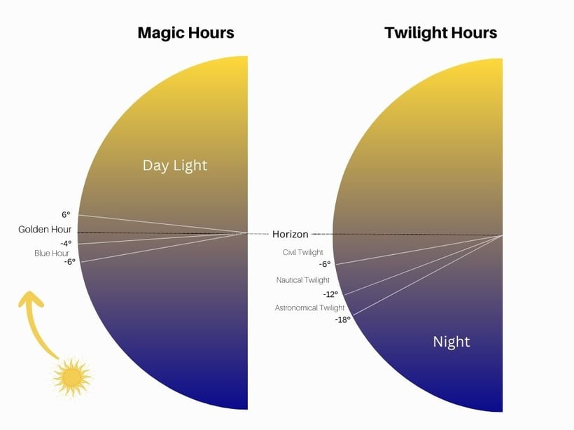
The Morning Magic hours
Blue Hour: Sun is between -6 degrees and -4 degrees
Golden Hour: Sun is between -4 degrees and 6 degreesDaytime: Sun above 6 degrees
The Evening Magic Hours
Golden Hour: Sun is between 6 degrees and -4 degrees
Blue Hour: Sun is between -4 degrees and -6 degrees
As we transition into night there are three further phases that i will list just for completion of the sun phases.
Twilight Phases
Civil Twilight: Sun is between 0 degrees and -6 degrees
Note both Blue Hour and Golden Hour are present during Civil Twilight
Nautical Twilight: Sun is between -6 degrees and -12 degrees
Astronomical Twilight: Sun is between -12 degrees and -18 degrees
Night time: Sun is below -18 degrees
Why is it important to think in terms of degrees instead of time?
Have you ever been walking to a desired location only to end up running as the sky bursts into life right in front of you. You curse to yourself saying sunrise isn’t for another 30 minutes and if only I had left 30 minutes earlier. Yes we have all experienced this!
As I write this at the end of March in the northern hemisphere sunset today is 06:55. However Golden Hour is actually 06:34 to 07:40 when you think in terms of sun position.
So if I planned to get to my destination just before sunrise at 06:55 it is likely that I could have missed some of the best light and be already halfway through Golden Hour before I even had chance to get my camera out of my bag. This is why I always use the sun elevation times to plan my trips not sunrise times.
Golden Hour
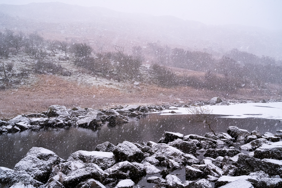
The Golden Hour phase of light can be defined as when the elevation of the sun is from -4 degrees to 6 degrees. This is when the sun is low in the sky and clouds are lit from below which can produce dramatic and colourful skies.
As its name implies golden hour is when the light transitions from Red hues to a golden yellow warm light temperature which is soft and diffused. Due to the sun being low in the sky the light is diffused and soft with less contrast and why it is the favourite time of the day for Landscape photographers.
Subjects are illuminated by sun rays at acute angles below 6 degrees and often this soft golden light can be easier to work with and produces natural contrast and depth. Any clouds in the sky can also act as huge reflectors reflecting subtle light onto the subject from above or as a large canvases in the sky.
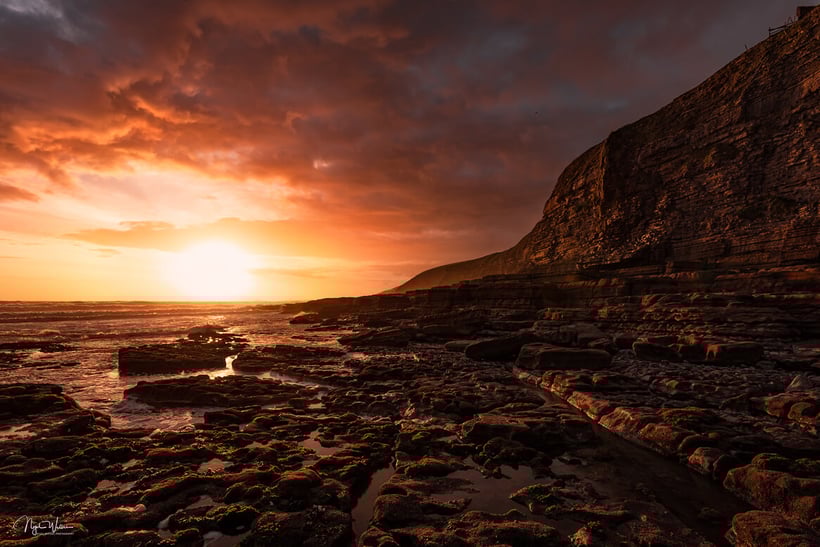
Subjects silhouetted against the colour of the sky or sun light during this phase can work well or large compositions with the sun low in the frame. However my personal choice is to shoot subjects with the sun behind me or to the side using the golden light to illuminate the subject in front of me. This can be particular faltering for portraiture photography.
One final point about light during Golden Hour is that the evening light can often be warmer than morning light. This is due to more particles being present in the sky to diffuse the warm light of the sun.
Although evening light is easier and you don’t have the early morning alarm call to wake you up especially in the summer months, I prefer the morning light where it is fresh and nature is just waking up and what I like to call Quiet Light.
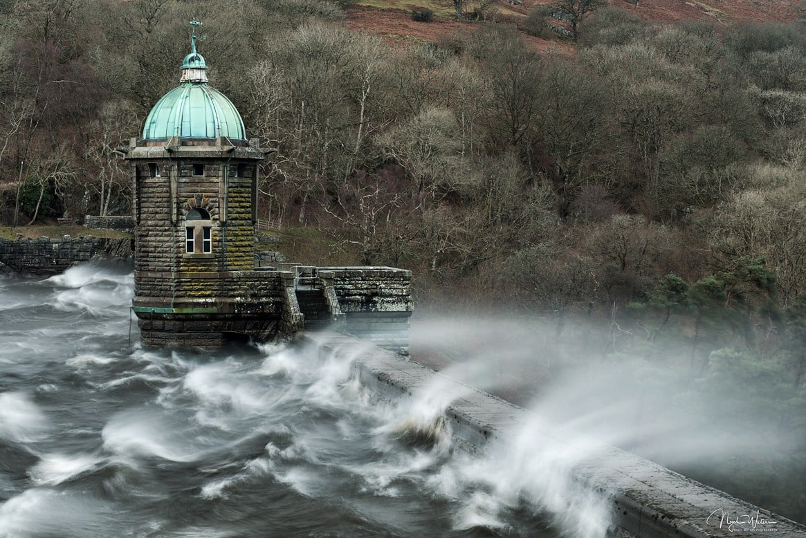
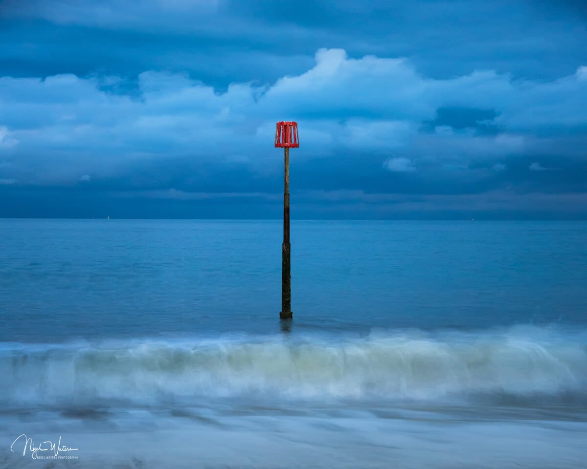
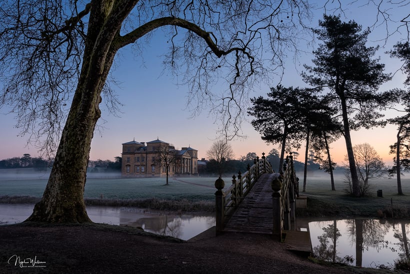
Blue Hour
Blue hour phase of light is defined when the elevation of the sun is between -6 degrees and -8 degrees. During blue hour the sky turns a deep blue hue where you get a colour gradient as it transitions from blue to yellow where the sun has set or about to rise on the horizon.
The colours in the sky are saturated during these phases and it can make for beautiful landscape and seascape images. It is my preferred time shoot cityscapes when they are also illuminated by streetlights adding extra dimensions to my images.
With modern camera technology and the crazy dynamic ranges that the latest image sensors can cope with blue hour can be a very special time to be out taking images. I strongly suggest to give this a go where you can take images where it is near impossible to see with the naked eye.
It is possible for a camera to pick out detail in very low light conditions and this can work extremely well looking for shapes or leading lines creating etherial like, calm and pleasant photography. It is one that I don’t practice enough myself and something I must do more of over the year ahead.
This very cool light that is produced during this sun phase long after the sun has set or before it is due to rise has led to it being commonly known as the Blue Hour.
Daytime
This is when the sun is above 6 degrees and light will change through the seasons depending on sun elevation and the weather. In the winter months the sun is much lower in the sky and with the right weather conditions can produce amazing light all day long you just have to brave the elements and the cold.
During summer months when the sun is high in the sky it creates a very harsh light and this really doesn’t show landscapes at their best and why most landscape photographer try to avoid this time of the day. However just because the sun is harsh doesn’t mean there isn’t a photograph to be had and you might as well stay at home.
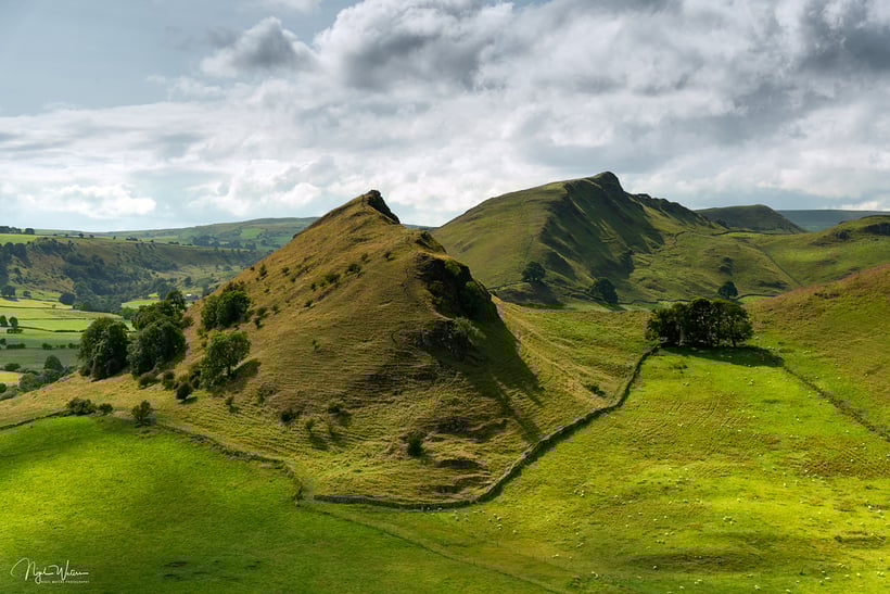
On harsh sunny days man made subjects can make great photographs and even landscapes can be pleasing on the eye especially in monochrome. If I am out and the light is harsh I try and switch my brain to see in black and white and shoot images with monochrome in mind.
I won’t go into detail here about the night phases of light and save that for an Astrophotography nightscape post in the future.
To answer what is the best time of day to pictures outside?
Well as explained there really is not a simple answer and its for you the photographer to decide what type of light will best suite the subject you intend to shoot while anticipating the weather conditions for any given time. However most landscape photographers would agree during the phases of Golden Hour are the best times of the day to take pictures outside.
There is always a photography to be had when out with the camera it really is just about being able to see it and why I encourage anyone to get out as often as they can no matter what time of the day or night. The more you practice the more you see the more photographs to be proud of you will have.
Most of all a better photographer you will become!