

The difference between Vibrance vs Saturation
How to adjust Vibrance and Saturation in Photoshop
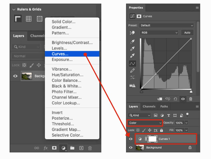
Vibrance Adjustment Layer
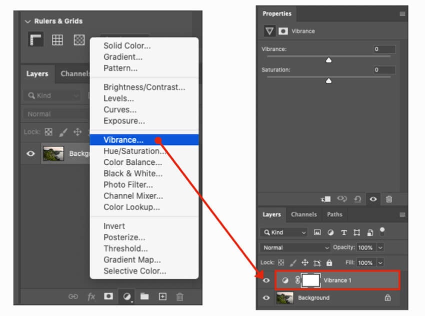
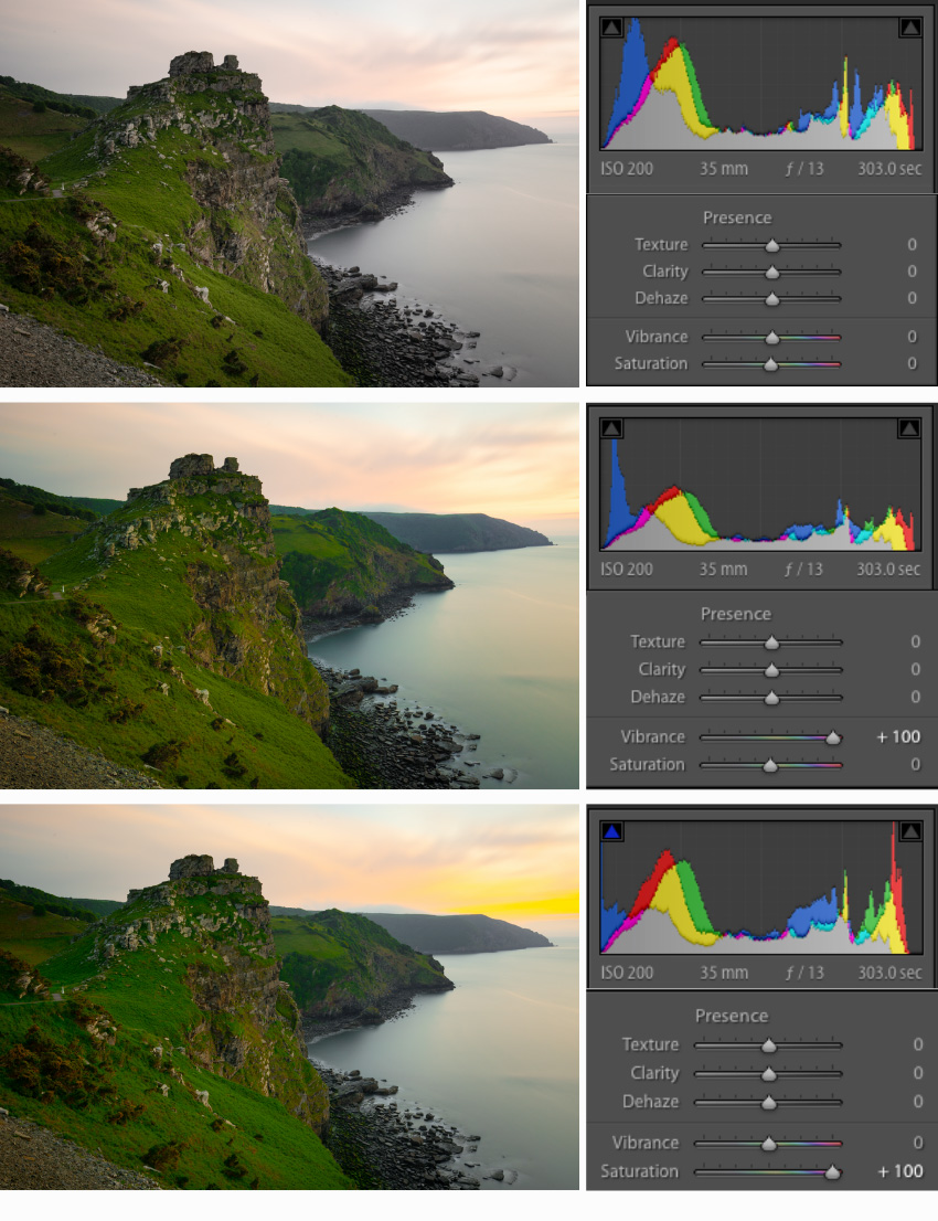
Using the Properties Pallet you can now add or decrease the Vibrance in the image by using the slider. To show the difference between Vibrance vs Saturation lets adjust both sliders individually to 100% and compare the results on the same RAW image.
The results show how using the saturation at 100% over saturates the greens of the grass and orange and yellow hues in the sky. With vibrance set to 100% the image is still a little over saturated but you can clearly see the difference in the grass and sky.
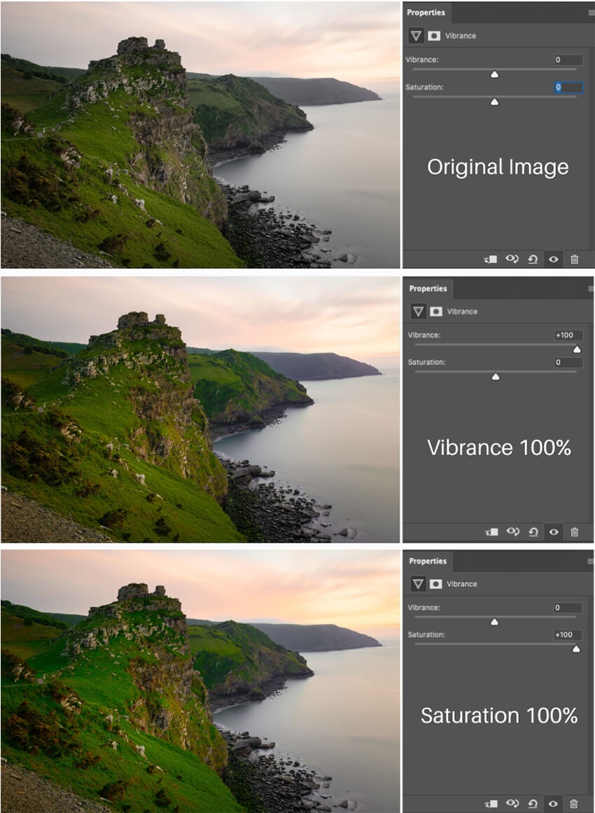
To find the sweet spot I usually use both sliders together where I would add Vibrance but also a little Saturation just to give the image an overall boost if required. Remember this is a RAW image and is by no means the finished article and requires further adjustments such as exposure and contrast.
Hue and Saturation Tool
This is what I find most people jump in and start using to adjust saturation and great care should be taken not to clip colours or posterise the image. This method I find to be quite course and recommend using the Vibrance Adjustment Layer instead.
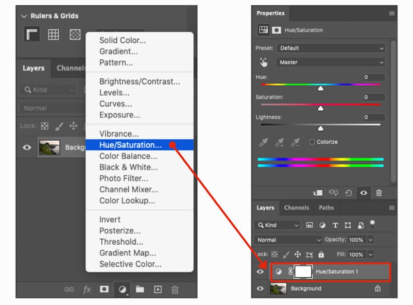
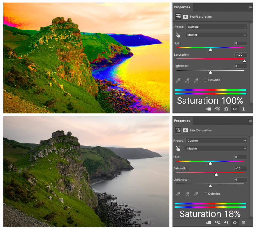
To show the difference between using this method and the Vibrance layer I have used the same image and taken the Saturation to 100% in the properties pallet. You can see how it has caused a posterised effect and totally destroyed the image.
In order to get the image to something acceptable I had to use a saturation value of 18 which shows how course this slider is and why I would advise to use the Vibrance Adjustment Layer for much better control.
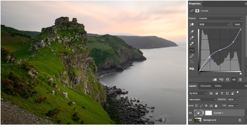
Curves Adjustment Layer using Saturation blend mode
This method can be used for changing saturation specific to tonal ranges such as shadows, midtones and highlights. In the example below I have increased the saturation of the colour in the shadows and highlights and can vary the amount by altering the shape of the curve.
In this example I increased the saturation of the greens in the shadows and the yellow and oranges of the highlights in the sky. It can be a little confusing at first but the best way is to just experiment and get used to using curves not only for Luminosity but also Colour.
Learning to use curves is an invaluable core skill in image editing and one I urge anyone to practice and learn to use adding depth to images and making colours pop. For targeting specific colours I highly suggest learning to use the Selective Color adjustment layer.
By far my preferred method and the one I use most in Photoshop to increase saturation is the Vibrance adjustment layer but I think it is always good to know and understand other methods and how they differ.
A good tip is to remember that you can make even further fine adjustment on any of these layer adjustment tools by simply reducing their individual opacity percentage.
How to adjust Vibrance and Saturation in Lightroom
You can adjust Vibrance and Saturation in lightroom by using the sliders under presence in the side panel. These sliders work in the same way as previously outline for photoshop or do they?
I have to admit I never use Lightroom to make these types of adjustments and always prefer to do it in Photoshop so I decided to carry out the same test on the RAW image with both sliders individually at 100%. I was totally surprised at the results and they were not the same as the results I achieved in Photoshop.
Although results for Vibrance at 100% look similar using Saturation at 100%, Lightroom heavily saturated the yellows much more so than in Photoshop as you can see from these images.
The saturation slider in Lightroom is much more course than Vibrance the same as in Photoshop and I would recommend using vibrance for more fine adjustment and add a little saturation to give an overall boost.
Like everything in Post Processing less is often more and with saturation this is definitely the case and you want to make sure you don’t over cook it and end up with images that look over processed and unnatural.
The best advice I can give when it comes to any colour adjustments is to take time out and let your eyes re-adjust. While staring at all these colours making minor adjustments you become colour blind and will end up pushing your colour too far. Take a break once you think you are done and then come back and double check.
A quick method I always use is to convert the image to black and white allowing your eyes to settle then simply switch back to colour. If you fall of your chair because it is too saturated then dial it back a little and do the same again.
I hope you find this useful if so please feel free to drop me a comment below.
With years of experience and a number of award winning photographs Nigel Waters is a UK landscape photographer based in Worcestershire. With a passion for the great outdoors and continually chasing the light to capture beautiful photographs his landscape, seascape and nightscape photography will give you inspiration to get out and explore the best British landscapes have to offer.
August 27, 2021 @ 5:39 pm
Hi I have just started doing photography and interested in landscape. I think lightroom is a great software program. I have been looking at your photography for inspiration, it hinkley they are great work